Learn how to pair wedding linen colors with your palette, venue lighting, and place settings, and when to sample swatches before ordering rentals.
Choosing wedding linen colors is one of the decisions that quietly shapes how a reception photographs and feels, because table linens cover more visual space in a room than almost any other single rental item. The right color pairing pulls the room's palette together; the wrong one can clash with the venue's existing walls, flooring, or lighting in ways that are hard to fix once the room is set.
Linen color should be chosen after you know your overall palette, but before you finalize smaller details like menu cards or florals, since those elements are easier to adjust around a confirmed linen color than the other way around.
Start from your palette, not the linen catalog
It is tempting to browse a linen catalog first and pick whatever looks good on screen, but colors read very differently on a swatch photo than they do under real venue lighting. Instead, start with your two or three core palette colors and think about which one should dominate the table (usually the linen and napkins) and which should appear in smaller accents (florals, menu cards, ribbon, or chair details).
Neutral linen tones such as ivory, champagne, and soft gray remain the most requested choices because they pair with nearly any accent palette and photograph consistently across different lighting conditions. Bolder linen colors can look striking in photos but require more planning, since they interact more visibly with skin tones, florals, and the venue's own wall colors.
Consider your venue's existing colors first
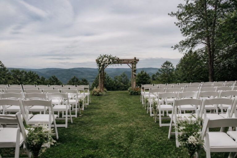
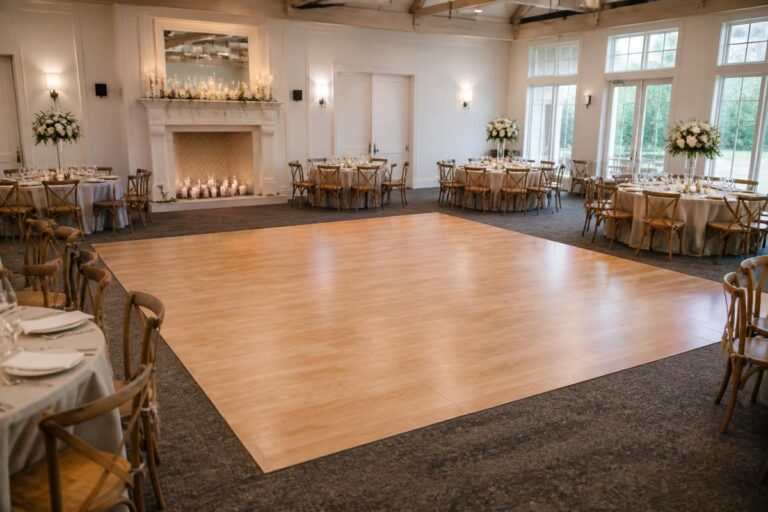
Before locking in a linen color, look honestly at your venue's walls, flooring, and any built-in decor you cannot change. A warm terracotta or wood-toned room will shift a cool gray linen toward looking muddier than it does on a swatch card, while a bright white ballroom will make almost any linen color read cleaner and truer to its actual shade.
If your reception is under a tent rather than inside a building, natural or tent-filtered daylight will change how colors appear throughout the day, and evening lighting will shift them again. Reviewing color theory resources such as Pantone's seasonal color guidance can help you understand how a shade might read differently in warm versus cool lighting before you commit to a full linen order.
Pair linen color with your place settings, not just your florals
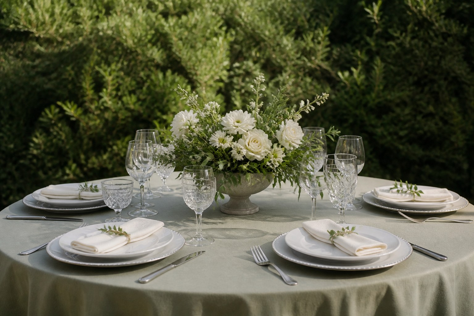
Many couples plan linen color around their florals alone, but place settings, chargers, and glassware sit directly on the tablecloth and interact with it visually every bit as much as centerpieces do. A darker linen color makes white china and clear glassware stand out more sharply, while a light neutral linen lets colored glassware or patterned china become the visual focal point instead.
If you are undecided between two linen colors, set both next to the actual chargers, flatware, and napkin folds you plan to use rather than comparing swatches alone. Small details like gold flatware or colored glass rims can tip the decision toward a linen shade that complements metal tones rather than competing with them.
Request physical swatches before ordering
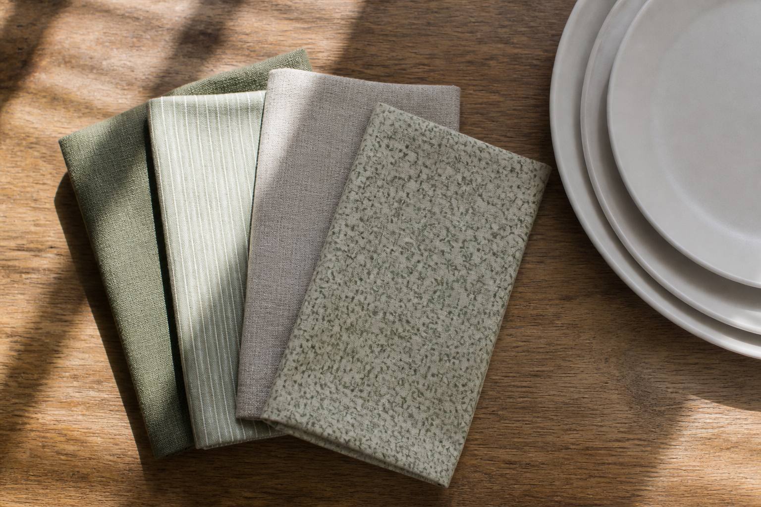
Screen colors are never fully reliable, and different monitors, phone screens, and lighting conditions can make the same fabric look noticeably different. Request physical linen swatches from your rental company so you can compare colors side by side in natural light and under any artificial lighting your venue will use for the reception.
When you compare swatches, bring along a paint chip or fabric sample from your bridesmaid or accent colors so you can see how the linen interacts with the rest of your palette in person, not just in your imagination. This step catches most color mismatches before they become a problem on the wedding day.
Consider the season and time of day for your reception
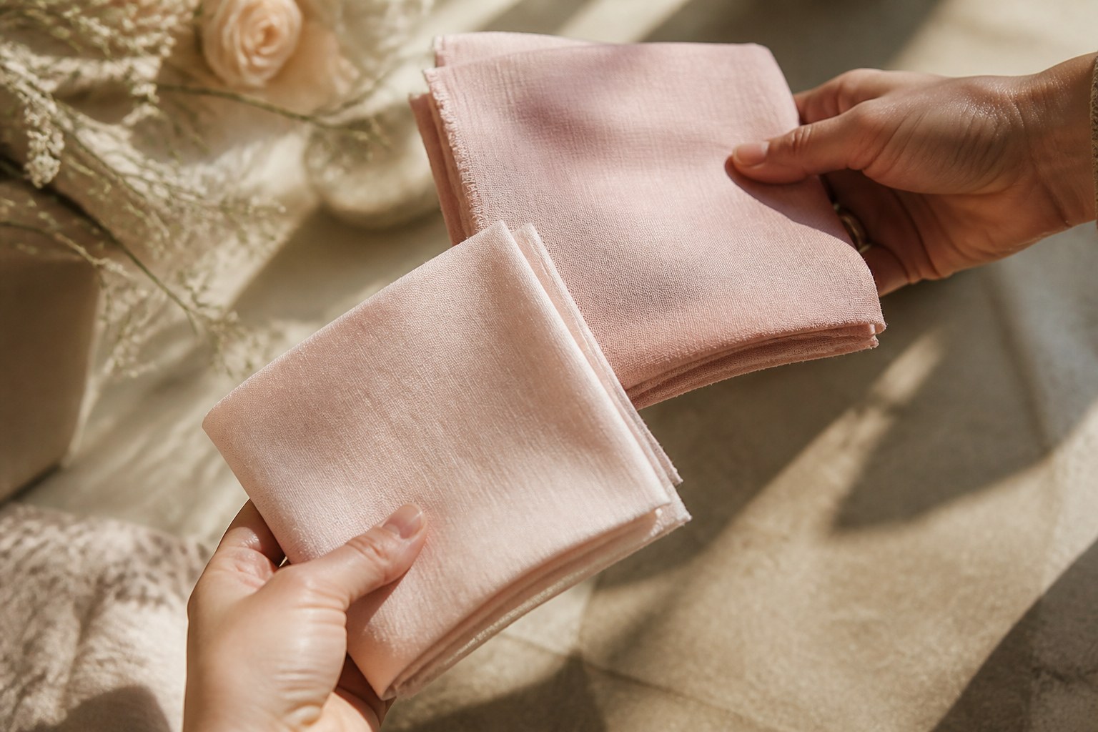
Lighting conditions change dramatically depending on whether your reception happens at midday, during golden-hour sunset, or fully after dark, and the same linen color will read differently across those windows. A soft blush that looks warm and flattering in late-afternoon light can appear pale and washed out under bright midday sun, while a deep jewel tone that feels dramatic in evening candlelight may look almost black in strong daylight photography. If you know your reception's approximate start time and the general direction your venue faces, mention it when reviewing swatches, since your rental team has likely seen how specific colors perform at similar times of day for past events at comparable venues.
Plan for mixing linen colors thoughtfully
Mixing two linen colors across different tables, such as alternating a neutral and an accent color by table number, can add visual interest to a larger reception without overwhelming the room. This approach works best when the two colors sit close together on the color wheel or share an undertone, so the room still reads as one cohesive palette rather than two unrelated looks.
If you are considering a mixed-linen layout, sketch or photograph your table arrangement in advance so your rental team can confirm they have enough of each color and size combination to cover every table without last-minute substitutions.
Think about how linen color photographs, not just how it looks in person
A linen color that looks perfect standing next to it in a showroom can photograph differently once it's captured under a photographer's flash, in ambient window light, or in an evening reception with warm overhead lighting. Deep, saturated colors like navy or burgundy tend to hold their richness well in photos, while pastel tones can sometimes wash out under strong flash photography and read closer to white than intended.
If photography is a priority for your reception, ask your photographer (or review their past work at similarly lit venues) about how certain linen colors have performed in previous events. This is a detail few couples think to ask about, but it can meaningfully change how your reception photos look years later.
Coordinate linen color across every table, not just the head table
It's common for couples to spend the most planning attention on the head table or sweetheart table, since it's the visual focal point of most reception photos, but guest tables make up the majority of the room and deserve the same color consistency. Confirm with your rental team that every table, including any smaller cocktail or gift tables, will use linens from the same dye lot or production run, since color can vary slightly between different manufacturing batches even within the same named shade.
This detail matters most for larger receptions with many tables, where even a small color variation becomes more noticeable when tables are viewed together across the room rather than one at a time.
Frequently Asked Questions
When should linen colors be chosen?
Choose linen color after the overall palette is known but before finalizing smaller details such as menu cards or florals.
Why request physical swatches?
Screen colors vary across devices and lighting conditions, so compare physical swatches in natural light and under the venue’s planned artificial lighting.
How can two linen colors be mixed?
Choose colors that sit close together on the color wheel or share an undertone, then confirm the rental team has enough of each color and size.
Bring your palette to the rental conversation
Once you have narrowed your linen color choices with real swatches, bring your final palette, table count, and cloth sizes into the same conversation with your rental planning so linens, chargers, and any accent decor can be confirmed together. Coordinating these choices in one order reduces the chance of a last-minute color mismatch arriving the week of the event.
Ready to compare linen swatches for your reception? Request a quote with your palette details, call us at (239) 768-6393, or contact our team to schedule a swatch review before you finalize your table design.